How GIS Teams Can Present Spatial Data to Non-Technical Leadership
Updated excerpt test
Only about 5% of people in data science and engineering fields know how to work with geospatial data. That figure appears in both SafeGraph's geospatial integration guide and Infosys BPM's spatial data analysis — and it explains a problem GIS professionals encounter constantly: the map you built in three days gets a 30-second glance from leadership before someone asks, "So what do we do with this?"
The technical work is solid. The communication layer isn't.
This post is about fixing that: how to translate spatial insights into decisions your executives will actually make.
Why Spatial Data Is Hard to Present (And Why It's Not Your Fault)
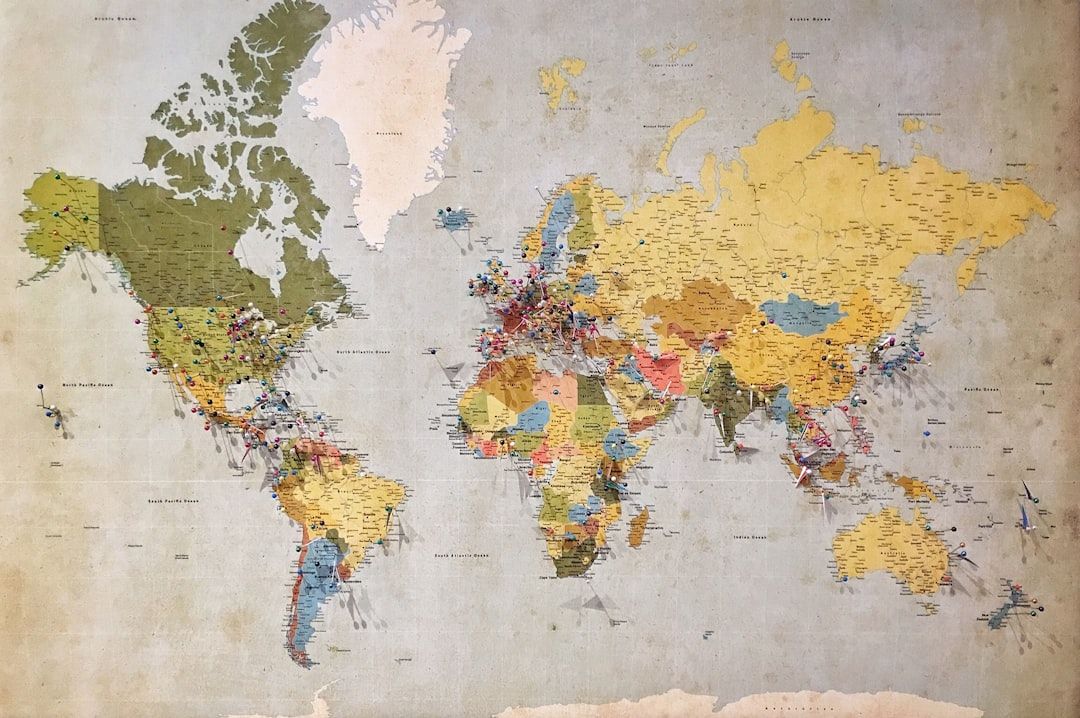
Maps are deceptively complex. When you look at a choropleth of parcel ownership concentration by county, you see ownership risk, data gaps, legal fragmentation. An executive sees colors on a map.
The problem isn't the map. It's the shared context required to read it.
A 2024 study published in Sustainability (MDPI) on GIS adoption across government and business found that the primary challenge isn't technology. It's the "lack of expertise and research" on the user side. Your stakeholders weren't trained to interpret spatial outputs. That's not a failure of intelligence; it's a failure of onboarding.
Esri's ArcNews published a feature titled "How to Lead with GIS" that opened with this: "GIS is still often overlooked in leadership discussions and executive strategy sessions. This needs to change." Esri is the dominant GIS platform on the planet. That sentence says a lot.
Three structural issues make GIS data presentation for executives hard:
- No shared vocabulary. Executives speak in revenue, risk, and timelines. GIS professionals speak in projections, fill rates, and topology.
- No familiar format. A bar chart slots into any slide deck. A GIS layer does not.
- No obvious "so what." A map shows where something is. Leadership needs to know what to do because of where it is.
The Translation Framework: From Layer to Decision
Good GIS communicators don't present spatial data. They present decisions that spatial data makes possible.
Here's a translation framework used by GIS strategists working with executive teams:
Every layer of GIS work maps to a layer of business language. When you stop at the analysis step and hand over a map, you've done 80% of the job and skipped the part that drives decisions.
Four Formats That Actually Work in Boardrooms
GIS practitioners who work regularly with executive teams converge on four presentation formats:
1. The "Before vs. After Coverage Map"
Side-by-side maps showing data state before and after an acquisition or improvement effort. Leadership can see the gap literally disappear. No legend literacy required.
When to use: After a data update, county refresh cycle, or new source integration.
2. The One-Number Summary
Pick the metric that matters most and make it big. "Coverage: 94% of US parcels" or "Fill rate dropped 8 points in Q1 rural counties." A single number with a trend arrow does more than a full dashboard.
When to use: Opening slides, status updates, board decks.
3. The Risk Table
Convert spatial gaps into business risk in tabular form. Leadership is comfortable with tables.
| Region | Parcel Coverage | Fill Rate (parcel_id) | Risk Level | Action |
|---|---|---|---|---|
| Northeast | 97% | 91% | Low | Monitor |
| Midwest | 88% | 74% | Medium | Prioritize Q2 |
| Southeast | 83% | 61% | High | Escalate |
| Mountain West | 79% | 58% | Critical | Immediate sourcing |
This format converts a GIS output into a project management decision instantly.
4. The Story-Driven Case Study
Pick one specific parcel, county, or project where the spatial data changed an outcome. A real estate investor who avoided a bad acquisition because lot-line data showed a zoning conflict. A solar developer who screened 400 parcels in a day instead of three weeks. Concrete stories compress complex methodology into something a room full of non-GIS people will remember.
What to Stop Doing
Stop presenting the full layer stack. Showing 12 overlapping data layers communicates thoroughness, not insight. Strip to one layer per decision point.
Stop leading with methodology. "We ran a spatial join on the county assessor file against the TIGER/Line shapefile, filtered by..." — you've lost the room by word eight. Lead with the finding. Explain the method only if asked.
Stop using GIS acronyms without translation. APN, FIPS, parcel_id, topology: native vocabulary for GIS professionals, foreign language for everyone else. Build a one-slide glossary if you must use them, or swap to plain English entirely.
Stop assuming the map is self-explanatory. Every map in an executive context needs a one-sentence takeaway in the slide title. Not "Parcel Data Coverage by County." Try "Rural Counties Below 80% Coverage Are Concentrated in Three States."
The Data Quality Problem Nobody Talks About
Most GIS communication guides skip this: bad data makes good communication impossible.
If your parcel_id fill rate is 62% in a target region, no amount of storytelling will make leadership confident in decisions based on that data. The communication problem is real, but underneath it is often a data quality problem.
GIS teams presenting to leadership need three things before they walk into the room:
- Accurate coverage numbers — what percent of parcels exist in your dataset for the target area
- Fill rate by key field — parcel_id, owner name, acreage, zoning; not all fields matter equally
- Source freshness — when was this county last updated? Stale data with good coverage numbers is still a risk
If your underlying data has 94%+ coverage across all 50 states with documented field-level fill rates, you can walk into any executive meeting with numbers you trust. If it doesn't, the presentation anxiety isn't about communication skills. It's about not fully trusting what you're presenting.
GetParcelData covers 160M+ parcels across all 50 states, with coverage statistics documented at the county level. GIS teams use it because the fill rate data is transparent: you know what you're presenting before you present it.
The Simplest Possible Improvement
Change your slide titles.
Most GIS slide titles describe the content: "Parcel Coverage Map — Q1 2025." Executive-ready titles describe the takeaway: "Three States Account for 70% of Our Data Gap."
That single change — turning descriptive titles into declarative ones — converts a report into a recommendation. Leadership reads declarative titles and immediately knows what you need from them. That's the whole job of a presentation.
Conclusion
The gap between GIS analysis and executive decision-making isn't a technical problem. The spatial data is solid. The analysis is sound. What's missing is the translation layer between a GIS output and a business outcome.
Build that translation into your process: derive the metric, frame it in business language, pick the right format, and cut everything that doesn't drive a decision.
The other half of the equation is starting with data you trust. If you're patching together county assessor files from a dozen different sources, your presentation confidence will show it. A single source of truth for parcel data, with documented coverage and fill rates, gives GIS teams something they can stand behind when the questions start. The same principles apply whether you're presenting solar site analysis or BEAD fiber rollout mapping — data quality and clear communication determine whether your work drives decisions.